Displaying Qlik Dashboards on Big Screens
There is a common use-case for organisations to want to share Qlik dashboards with employees or customers using a big screen monitor or TV. This can be used as mechanism to share wait times in waiting rooms, establish friendly internal competition in workplaces such as distribution and call centres, or even highlighting downtime/slowing running machinery on production lines. Internally, before COVID-19, we used a big screen to drive communication between different departments of our business. We did this by having a carousel of dashboards:
- Sales dashboard: Showing number of calls made, recent wins and current opportunities.
- Services dashboard: Showing billable hours worked, customers engaged with, etc.
- Support dashboard: Number of active tickets, number of recently opened/closed tickets, and average response times.
This had a real impact on us as a business. For example, the sales team had more visibility over their accounts through the services and support dashboards and could clearly see how their customers were engaging with us post-sale. The services team could spot when a customer they had interacted with recently raised a support ticket, meaning they could pro-actively volunteer advice, and Support could allocate tickets to consultants they could see had worked with the customer recently.
What I’m going to cover in this post is one approach to displaying Qlik dashboards on big screens and our tips and tricks to getting them looking their best.
How to implement a carousel of Qlik dashboards on a big screen:
There are several methods to this, my favourite at the moment and easiest is using a Google Chrome extension called Rotisserie URL Rotator. Unfortunately, it’s recently gone missing from the web store but I found a link to an offline version which appears to work fine. If you’d prefer to use the web store, then there are alternatives such as Revolver – Tabs, which work in a similar manner.
These extensions allow you to specify multiple URLs and it will cycle through each one and pause based on the specified ‘timeout’ duration. Due to Qlik Sense being URL driven, this is the perfect solution. With Qlik you can acquire a URL to a specific sheet or even visualisation within an app and add it to the extension. You can even specify bookmarks or individual filters as part of the URL, and therefore cycle through the data.
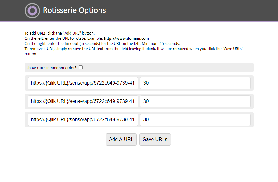
With Rotisserie, it couldn’t be easier to add your URLs, in the left input box, and add the duration it should stay on the page, on the right. Once activated, it will cycle through the URLs in a single tab which presents a smooth carousel of your data.
Obtaining URLs from Qlik Sense
Let’s look at the different ways to obtain a URL for a Qlik Sense Sheet, Visualisation and include a bookmark.
1. Sheet URL: This is the simplest option, navigate to the Qlik Sense Sheet you want to display on your Big Screen and copy the URL from the browser address bar. 
2. Visualisation URL: This is easy also, but has a few steps. Right-click on any object in your Qlik Sense sheet, followed by Embed chart. Towards the bottom-left corner, click the ‘Open preview in new tab’ link and copy the URL.
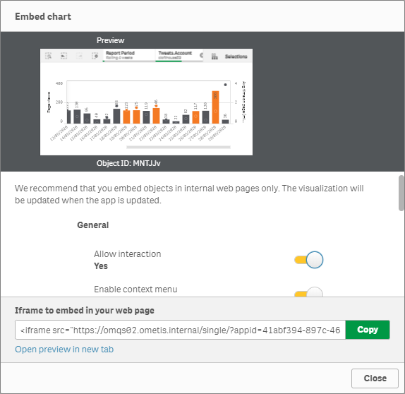
3. Add filters/Bookmarks: In a similar manner to the previous, navigate to the Embed chart menu of the visualisation, or to apply filters/bookmarks to a sheet click on the main navigation menu of the app, followed by ‘Embed sheet’.
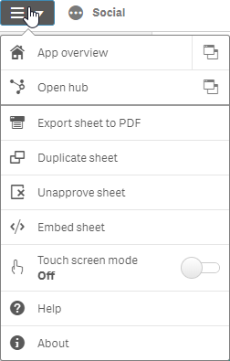
In the Selections section of the embed menu, configure the properties to your requirements. Here you can choose to apply a bookmark or use current selections to define the inital selection state.
Design tips for Big Screen Dashboards
- Keep it simple and BIG! Have the minimal number of objects on the screen as possible, and give them maximum space. This will ensures the data is conveyed clearly and quickly to everyone – remember the screen will likely cycle after a period of time, so speed to interpret the information is critical.
- Build for an Overview of the data and not for interactive analysis. Focus on KPI’s and other visualisations that provide an overview rather than detail. Pro-active seek dimensions with few segments that don’t rely on users to drill into the data or think to much!
- Use indicators and colour to provide more context if the numbers, inform users of good and bad performance.
- Keep text to a minimal – there’s nothing worse than straining your eyes trying to read text of a screen far away.
- Consider going dark! High contrast between text and background reduces eye strain. Dark themes can also reduce eye-strain in low-light environments. It can also make for more attractive dashboards and grabs user attention.
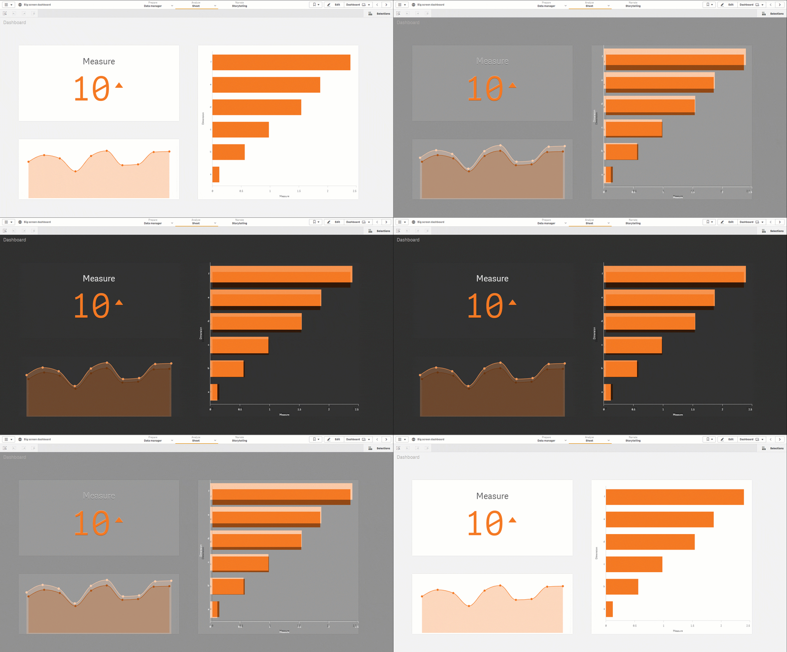
Hopefully, this has given you a new use-case for Qlik or maybe provided you with an alternative approach to how you currently display your Qlik dashboards around your business. Remember to click the Like button and follow us on Twitter, LinkedIn and Youtube.
By Chris Lofthouse #QlikLuminary
Follow @clofthouse89




.png)
Comments