Sorting Visualisations in Qlik Sense
Sorting in Qlik Sense, and by that we mean sorting visualisations in Qlik Sense or any other Business Intelligence tool, is more important than you may think.
Sorting in Qlik Sense incorrectly can cause confusion and potentially lead people down the wrong path of analysis. It may be possible to sort a visualisation in many different ways but that doesn’t mean you should. The method of sorting is completely dependent on the data you’re analysing.
Use-Cases
There are two ways you can sort a visualisation in Qlik Sense, either on a dimension or measure. Let’s take a look at the use-cases for sorting on each of these.
Most commonly a dimension will contain three types of data:
- Nominal values, existing in name only with no given sort order.
- Ordinal values have a prescribed order (a natural ranking), such as ‘1, 2, 3, 4’, ‘small, medium and large’ or ‘strongly agree, agree, neither agree nor disagree, disagree and strongly disagree’.
- Interval values are a sequential series of numerical ranges. The most obvious example is time, such as months ‘Jan, Feb, Mar…’ each month represents a duration of time that happens is a consecutive order. Other examples include numerical ranges, for example ‘>=0 and <10, >=10 and <20..etc’.
Once you determine the type of data you are visualising, sorting that data becomes simple. For the examples in this post I will be using the Nutrition Facts for McDonald’s Menu found on Kaggle.
Use case - Nominal values
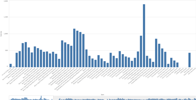
Sorting alphabetically in Qlik Sense
The values above represent nominal data, sorted alphabetically on the dimension. Sorting data alphabetically has got to be one of the biggest sins in data visualisation. There is no worse sort order that could be used. Looking at the visualisation above, most users would struggle to obtain all the facts. When the dimensional values have no prescribed order, revert to sorting on the measure.
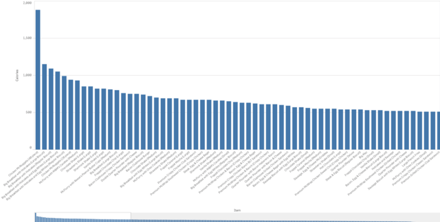
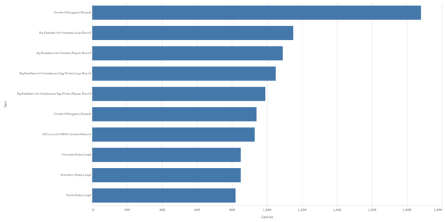
Sorting numerically on the measure effectively displays the top-to-bottom performers, and vice versa. This provides users with quick access to select the top 10 or 20 values without thought, enabling them to slice and dice the data more efficiently. It’s interesting to note, if the dimensional value is nominal, it is often best practice to present the bar chart horizontally instead. Equally, to focus a user’s attention on the top or bottom values implement a limitation on the dimension:
Use case - Ordinal values
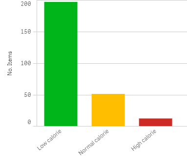
Take the example below, we have an ordinal set of values consisting of low calorie, normal calorie and high-calorie food items. This is an ordinal sort as there is a natural sort order of ‘low, normal and high’. Unfortunately, Qlik doesn’t know this order, how could it? It’s not context-aware (at least not yet).
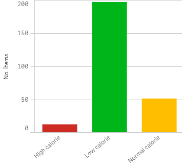
We therefore need to create an expression to sort the values correctly. This is achieved using the DUAL statement. The DUAL statement enables developers to assign a numerical value to a text value. The text value is displayed while the numerical value is used for sorting and calculation purposes. To create these buckets, I used the Data Manager to add the following calculated field in the script:
IF(Calories <= 500, DUAL(‘Low calorie’, 1),
IF(Calories <= 800, DUAL(‘Normal calorie’, 2),
DUAL(‘High calorie’, 3))) AS [Meal Type],
Note: This is easily achievable in the Data Manager using the conditional function group and the Sort Profiling card.
Qlik Sense will now auto-sort the data correctly. It’s important to note that while you can use custom sort expressions in the visualisation, it is best practice to move these expressions to the script where possible.
Use case - Interval values
Remembering that interval values are a sequential series of numerical ranges, whether the data is time or bespoke buckets, we handle them in a similar manner to ordinal values. By that I mean we use the DUAL statement to sort the data correctly based on their numeric equivalent. For example, below I have grouped the calorie ranges into bespoke buckets based. This was achieved by adding the following calculated field:
IF(Calories < 1, DUAL(‘Zero calories’,0),
IF(Calories <= 1000,
DUAL(LEFT(REPLACE(REPLACE(Class(Calories,100,’-‘,1),'<=’,”),'<‘,”),
LEN(REPLACE(REPLACE(Class(Calories,100,’-‘,1),'<=’,”),'<‘,”))-1)&’0′, NUM#(PURGECHAR(Class(Calories,100,’-‘,1),’-<=’))),
DUAL(‘>1000’,9999999))) AS [Calorie range]
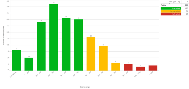
To sort this data in any other order than sequentially, as above, would be meaningless and confusing. Again, Qlik Sense will automatically sort the values correctly, based on the DUAL statement. This enables Qlik users to self-serve with ease and not worry about sorting.
To summarise, when there is no logical or natural sort order, to the dimensional values, sort by the measure (ascending or descending, based on what you’re trying to achieve). If you are visualising ordinal or interval data use the Sort Card in the Data Manager or DUAL statement in the Data Load Editor to achieve the correct sort order.
If you would like to know more about Qlik Sense or stay up-to-date with all things Qlik please remember to follow us on Twitter, LinkedIn and YouTube.
By Chris Lofthouse
Follow @clofthouse89
Topic: Data analytics


Comments