Qlik Sense June 2020 Release (Client-managed and SaaS)
It’s approaching the midway point in the year which means we get Qlik’s latest June 2020 release for both the client-managed and SaaS versions of Qlik Sense. In this particular release post we will try something new ourselves and talk about both, previously we focused on just the client-managed (Windows edition). There’s some great new functionality, so let’s get stuck in.
SaaS and Client managed changes in Qlik Sense June 2020 Release
Sheet view/edit changes
Let’s roll up our sleeves and get into this release then! The first subtle change is the order of the buttons on the right hand-side of the main toolbar. The Edit sheet button now appears on the far right, previously located between the bookmark and sheet selector buttons. It is also Ometis orange, which looks fab and suits us just fine.

In edit mode there is also a subtle change which is really useful. That being ‘Fill on resize’. This means that if you double-click on any object anchor or boundary line it will fill the available space. Pretty neat!

Filter pane improvements
High on my list of desirable functionality that has appeared in Qlik Sense June 2020, is Copy cell value on the filter pane object:
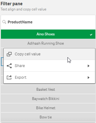
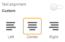
Unfortunately, you can’t copy the cell value of the fields that appear in the selections toolbar/tool which is slightly disappointing but this is still a welcome addition. It also comes with the ability to control the text alignment per dimension:
Mini charts/Sparklines
Mini charts are now available in Qlik Sense June 2020. Formally a gap in functionality compared to QlikView, mini charts have made their way into the Straight table in Qlik Sense. Mini charts allows Qlik users to represent a measure over a second dimension in a table cell. They are typically used to offer users some insight into the movements of a metric over time. The different chart types include Line (Sparkline), Bar, Dots and Positive/Negative (whiskers):
 To enable the mini chart in the straight table, you must switch the ‘Representation’ within the measure properties to ‘Mini chart’.
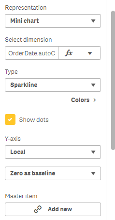
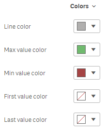
This will allow Qlik users to select a dimension to slice the measure by and then select the type of chart to display. Qlikkies can also customise the options for displaying the y-axis of the mini-chart as Local (axis range is specific to the row) or Global (axis range considers the min and max values of all rows within the table). In addition, you have some control over the axis, with the following options: Auto, Zero as center (useful in combination with Positive/Negative charts) and Zero as baseline. We’ve also been spoiled with the choice to hide/show dots (data points) and control of some of the colours:
Given the simplicity and small footprint of sparklines, they can be very useful for providing quick (high-level) insights. Their compact nature looks visually appealing and gives Qlik users an excuse to put a table on the sheet. However, there are some limitations worth thinking about. The first is that there is no tool-tip per data point, it is of the entire cell measure:

The second is that mini charts don’t show the axis, this can make it difficult to know exactly what you are looking at, for example if you look closely at the first column (Line with max min) for Minnki Palsii, this is showing sales by month, but without using annotations in the table there is no way of the user knowing that. You may also notice there are only 8 data points for this particular product, so we can’t honestly expect the user to accurately understand what we are showing them. For reference, this is what the first sparkline in the above table actually shows:

Here you can clearly see there is no data for ‘Minnki Palsii’ for the months March, April, May and June. Therefore, it would be great to able to have either a tool-tip per data point on the mini charts or the ability to explode the mini chart to full-size. Better yet we’d like both if we were making demands! Perhaps in a similar fashion to the ‘View data’ option on a Qlik chart, it would be nice to have an ‘Inspect chart’ per mini chart within the Table object. For now, we will have to manually cater for this using a table and an ‘exploded’ version of the mini chart in a container!
Further table improvements
Since we are talking tables, there are some nice improvements to both the straight and pivot table:
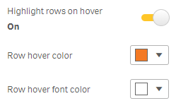
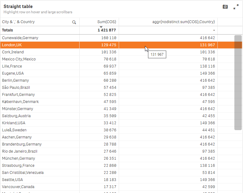
- Highlight row on hover: in the advanced styling options of the two tables you have the ability to control the Highlight rows on hover, allowing Qlik users to customise both the foreground and background colours.
- Scrollbar size: also in the advanced styling options panel, you can now change the size of the scrollbar, which had troubled some users as the default is not always obvious. Options include a small, medium and large.
Here is an example with Ometis orange background colour and a large width scrollbar.
New native Bullet chart object
The bullet chart is a variation of a bar chart that acts as an alternative to gauges. Replacing the same named chart in the visualisation bundle, this enables data visualisers to display KPIs differently, with an inner bar showing actual values, an indicator showing the target and background colours to highlight qualitative ranges, such as good, average and bad. Here are some examples:

I’ll be honest, I never used its predecessor in the visualisation bundle, partly because it had a different look and feel about it, so it appeared as though an Excel 95 chart had been imported into Qlik, but also because it didn’t work quite as I would have wanted. However, this new, shiny, native bullet chart has won me over completely. When adding a measure to the bullet chart, there are a few additional measure properties for this particular visualisation, as you might expect!
Firstly, within the measure properties, you’ll have an additional expression input box for the target calculation – this can be hard-coded or calculated. Secondly, you’ll have the ability to use segments, which is similar to that in the KPI object:

This is a fantastic addition to the native Qlik Sense chart library, and being native it comes with all the benefits such as theme support and multiple language support. I know I’ll be adding the bullet chart to some of our internal dashboards over the next few days.
Custom tooltip improvements
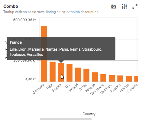
The custom tooltip has become even more custom! Now with the ability to display a title and description, you can create a well-presented overview of additional measures and other pieces of information for the user on hover. There are also no longer any restrictions on expressions, so you are free to use AGGR, ALL, TOTAL, RANK and anything else you can think of, which is great news. Here is an example of using country for the title and a concatenation of all the cities that are operated within it. In addition, the ‘basic row’ has been hidden (the basic row is the default information that contains the measure label and value).
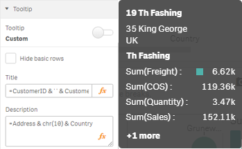
Furthermore, you can also implement line breaks with CHR(10):
This level of control of tooltips is a great addition to add those final touches to the dashboard and improve what and how we convey information to our users. It’s also nice to mention custom tooltips has now been rolled out to the line chart too, that’s in addition to the Combo, Treemap, Bar, Scatter and Map chart.
Other chart improvements
Number formatting on colour by expressions:
This is currently supported on the Bar, Line Pie and Map object and provides that much needed ability to set the number format in the colour by expression legend and basic tooltip. This will make it easier to present more uniform numbers.
![]()
Button:
An additional action of ‘Select on search criteria’ has been added. Making it easier to empower users to make more complex searches. This means you can use the greater than and less than notation as part of the criteria. For example, >=2020.
Org chart:
- Home button
- Auto zoom on expand and collapse
- Fully expand mode
- Border colour styling
ODAG (On-demand App generation) and Dynamic View improvements
If you’ve not come across ODAG before, I recommend this short overview I wrote earlier this year. In Qlik Sense June 2020, Qlik have made changes to the bindings and format of ODAG and Dynamic View queries, simplifying it by adding the ability to add bindings direct to the WHERE clause. Having said that, the old bindings will still work. In addition, there is a new binding for loading test data ‘odagActive’, as well as performance improvements for Dynamic Views:
- Reduce overhead.
- Decreased time between polls.
- Indications during refresh.
I’ll be writing a future blog post on Dynamic Views, so watch this space.
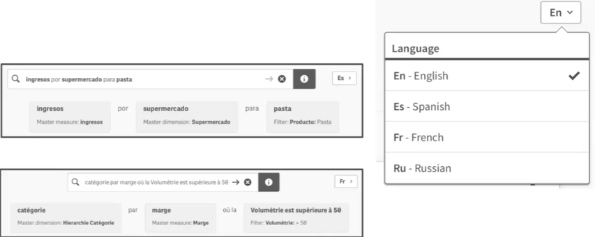
Multi-language for Natural Language Processing
Expanded language support for Natural Language analytics in Qlik Sense supporting non-English Languages:
- French
- Spanish
- Russian
Connectors
- Integrated connectivity to Qualtrics.
- New user interface combining info provider and BEx connectors into a single user interface as a BW connector.
Client-Managed specific changes in Qlik Sense June 2020 Release
Qlik Management Console Improvements
Qlik Sense June 2020 has a rare QMC improvement that brings bookmark capabilities to the QMC landing page. This enables Qlik administrators to store table views, preserving filters and column selections easily. This saves a lot of table configuring the views at the start of your session.
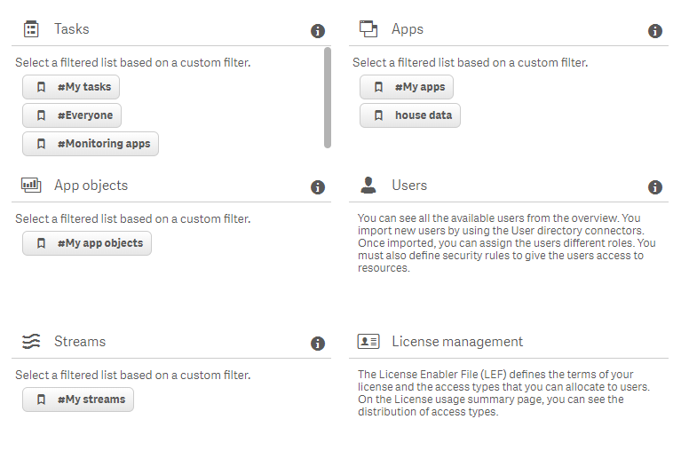
The user interface doesn’t leave you wanting more, this is solid function over form. It works and it’s really useful. When you upgrade there are some default bookmarks you have available, but you can update or even delete them. To begin, customise a view by adding/removing columns, apply filters or change the sorting. Next, click on the bookmark icon, located toward the top-right:
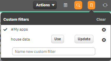
Here, you can either:
- Delete an existing bookmark by clicking on the cross.
- Apply a bookmark by clicking on Use.
- Or, if changes have been applied to the view, click Update to, well, update the bookmark.
- Lastly, by entering a new filter name and clicking the plus icon to confirm will add the bookmark to your list.
A really useful piece of functionality to help administer your Qlik site.
SaaS specific changes in Qlik Sense June 2020 Release
Support for larger apps
In Qlik’s first phase of delivering dedicated capacity in Qlik Cloud Services, they will enable consumption of larger apps, with support for the following:
- Max app size (on disk) capped at 10GB, and Max (in memory) supported app size of 50GB.
- Use for up to 10 customers
This is a really impressive first step and will open the door for a lot more existing Qlik customers to have the option of moving to Qlik SaaS, as well as making a SaaS-only deployment more appealing to new Qlik customers.
Export Stories to PDF
Some gap functionality to the client-managed offering, Qlik cloud can now export stories to PDF.
Qlik Sense Desktop Authentication in SaaS
Expands and improves administrative options within the cloud to unlock usage of Qlik Sense Desktop, allowing users that subscribe to Qlik Sense on Cloud Servers or Kubernetes to authenticate their allocated license to unlock Qlik Sense Desktop for 30 days.
This is acheived via Settings > Personal info > Qlik Sense Desktop
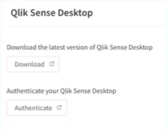
Only Professionals user can authenticate Qlik Sense Desktop, and it’s worth noting all Qlik Sense Business users are Professional.
Qlik Sense June 2020: Summary
Qlik’s ability to deliver feature-packed releases one after the other has clearly become the norm. Every release so far this year has been one not to miss, and this is no different. It does present the challenge for Qlik customers to keep on top of their upgrades, or those on SaaS I’m sure will have a smug grin on their faces. For those that are not on SaaS, and would like some assistance in upgrading Qlik, please get in touch with me and my team and we’d be happy to help.
Note: Any Ometis customer on our Proactive support offering can choose to use one of their three free upgrades.
By Chris Lofthouse #QlikLuminary
Follow @clofthouse89


Comments