Selections - The Most Underutilised Tool In Qlik Sense
Recently it has become apparent to me that many Qlik Sense users, and developers, forget a key view that is included in the base product of Qlik Sense – the selections tool.
I’m constantly talking to different customers, Qlik users and other Qlik experts and it surprises me how many of them forget, or simply don’t know, about this important tool.
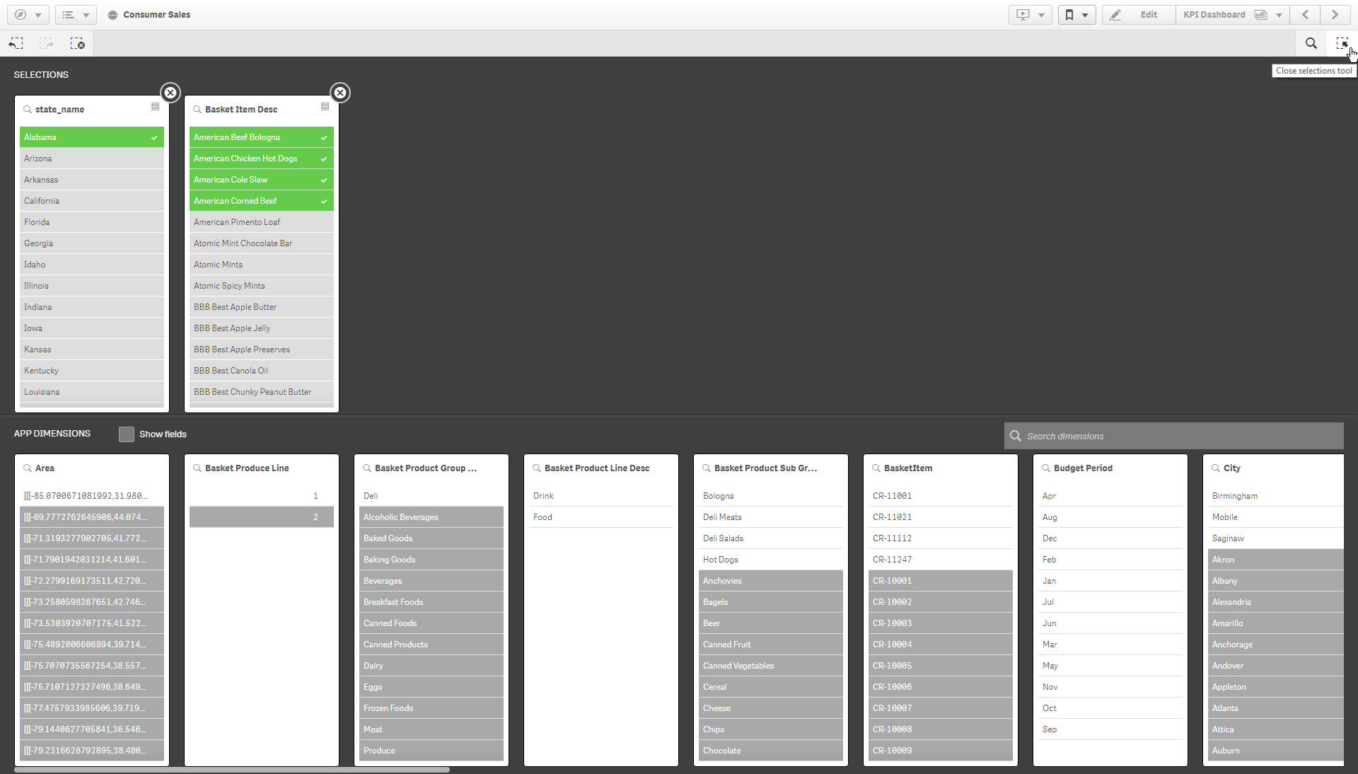
For those of you whom are unaware, the selections tool provides visibility of all the app dimensions (fields and single master dimensions), enabling the user to understand how the data is connected via the use of colour in expanded field lists.

To me, this feature is one of the key selling points of Qlik; demonstrating the associate engine, with the power of the Green, White and Greys. Allowing users to see what is associated and what’s not. The data not associated is just as important, if not more so than what is associated. This is because the dark grey, what’s not associated, highlights your potential risks and/or opportunities.
In this data-driven age, why are people making uninformed decisions?
If you were part of a jury in court, you wouldn’t listen to one side and make a decision, you would wait until you’ve heard all the facts; you would want to learn about the facts excluded by that first side. Making data-driven decisions should be no different. If you are using query-based tools, which can only work with subsets of data, then you are only seeing one side of the story. Become and continue to be data curious, don’t just look at the data in the charts, explore the data that’s not; that’s where the hidden insights are found!
Attacking data from multiple angles is a necessity.
Recently, I’ve touched on the importance of accessibility to users. This comes in many forms, including the accessibility to interrogate data, in free-form, without reliance on technical expertise. Providing users with partial datasets, or one side of the story, is effectively arming them with the confidence to make misinformed decisions. Often, less informed is better than misinformed. With Qlik Sense, and features such as the sections tool, users have access to all the data all the time, enabling them to define their own start and finish line.
I may have digressed a little, but the point I’m making is don’t settle for some of the facts. Learn to become a data skeptic, as mentioned in Qlik’s Do’s and Don’ts of data literacy. Above all, remember to explore the grey!
How do I access the selection tool?
In the sheet view of Qlik Sense, towards the top-right corner, within the selections toolbar, you will see the icon for the selection tool. Click this button to open it:
![]()
What do I need to know?
The screen is split into two horizontal panels, the top half displays your selections and the bottom half displays the app dimensions that exist in the application. Once a selection is made in a dimension it will move into the selection panel. Any selections made inside or outside of this tool will persist when you open or close it.
If the app contains single master dimensions, they will appear by default. This allows the developer to promote the use and interaction of specific fields. The user can also tick the ‘Show fields’ option to gain visibility of all the fields within the app.
![]()
When interacting with the data, the values will change colour based on your selections:
- white means it is associated to your current selections
- green values with a white tick are the values you’ve selected
- light grey are alternative values; these are still associated to your current selections but aren’t included within the selection criteria of that particular dimension
- and lastly, dark grey are excluded (not associated to your current selections).
At times you may also see dark grey values with a white tick, these are selected but excluded. For example, if you were to select the countries France and England, both these values will become green with a white tick. If you then selected the city of London, England would remain green but France, while still selected, is not associated to London and would therefore change from green to dark grey but still maintaining the white tick. Should at any point the city filter be cleared, France will return to the selected values (green).
Final thoughts…
The selections tool embraces the very heart of Qlik, providing data clarity between the connectivity of the data. While many Qlik users, including myself, neglect expanded filters panes on sheets in favour of more stimulating visualisations. Users must not forget to be data curious and remember to ask the not questions, something the selections tool is very effective at doing out-the-box.
Topic: Data analytics


.png)
Comments